Spice of India
Logo Identity for an Indian Restaurant in St. Lucia
Branding · Logo Design · Cultural Identity
Client: Spice of India, Rodney Bay, St. Lucia
Year: 2010
Services: Logo Design, Brand Identity
Deliverables: Master Logo (B&W), Usage Guidelines
THE BRIEF
Spice of India is a fine-dining Indian restaurant in Rodney Bay, St. Lucia, opened in 2010 by Restaurateur Chef Adil Sherwani. The restaurant combines modern Indian cooking with traditional Tandoor techniques, creating an atmosphere inspired by Indian culture and hospitality.
The restaurant needed a logo that would communicate authentic Indian heritage without falling into familiar clichés, feel premium and welcoming, and work effectively across signage, menus, packaging and digital applications. The identity was developed as a versatile black-and-white master logo, allowing it to adapt across different materials and applications.
THE CHALLENGE
Indian restaurant branding is a competitive category, often relying on familiar visual symbols such as elephants, paisleys, turbans and generic food-related typography. The challenge was to create an identity that felt culturally relevant without becoming stereotypical — a mark that could stand out in the Caribbean market while reflecting the character of Indian culinary heritage.
The logo also needed to communicate warmth, authenticity and premium quality, while remaining simple and versatile enough to work across different applications.
THE CONCEPT — "THE OFFERING"
The final mark combines two key elements: cupped hands and a Mughal arch. The hands represent the act of offering and hospitality, while the arch references Indian architectural heritage. Together, they form a unified silhouette that suggests an invitation into Indian culture and cuisine.
One-line idea: “We offer you India.”
Cupped hands: hospitality and offering
Mughal arch: heritage and cultural identity
Unified silhouette: sharing, connection and welcome
SYMBOLISM
| Element | Meaning |
|---|---|
| Cupped Hands | Hospitality, welcome and the act of offering |
| Mughal Arch | Indian architectural heritage and cultural identity |
| Jali Lattice | Craftsmanship, detail and visual richness |
| Unified Silhouette | Sharing, connection and togetherness |
| Symmetry | Balance, refinement and a sense of premium quality |
DESIGN DECISIONS
The master logo was developed in black and white to ensure maximum versatility across different applications and production methods. A single-colour version can work effectively across signage, menus, packaging, stationery, stamps and other printed materials. It also provides a strong foundation for applying colour through individual brand applications without changing the core identity.
The identity deliberately avoids familiar restaurant symbols such as elephants, paisleys and chef caricatures. Instead, the Mughal arch provides a more refined visual reference to Indian heritage, helping the identity feel culturally relevant while maintaining a sophisticated character suited to fine dining.
The balanced and symmetrical composition creates a sense of order, precision and refinement. This supports the restaurant's premium positioning while giving the mark a stable and recognisable visual structure.
APPLICATION
The B&W master flexes across contexts:
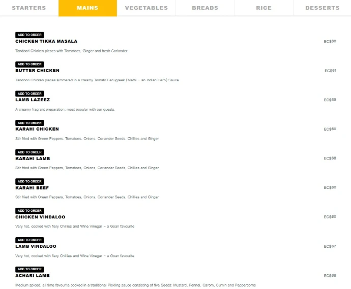
Menu cover — deep red + gold gradient logo
Signage — logo on restaurant facade
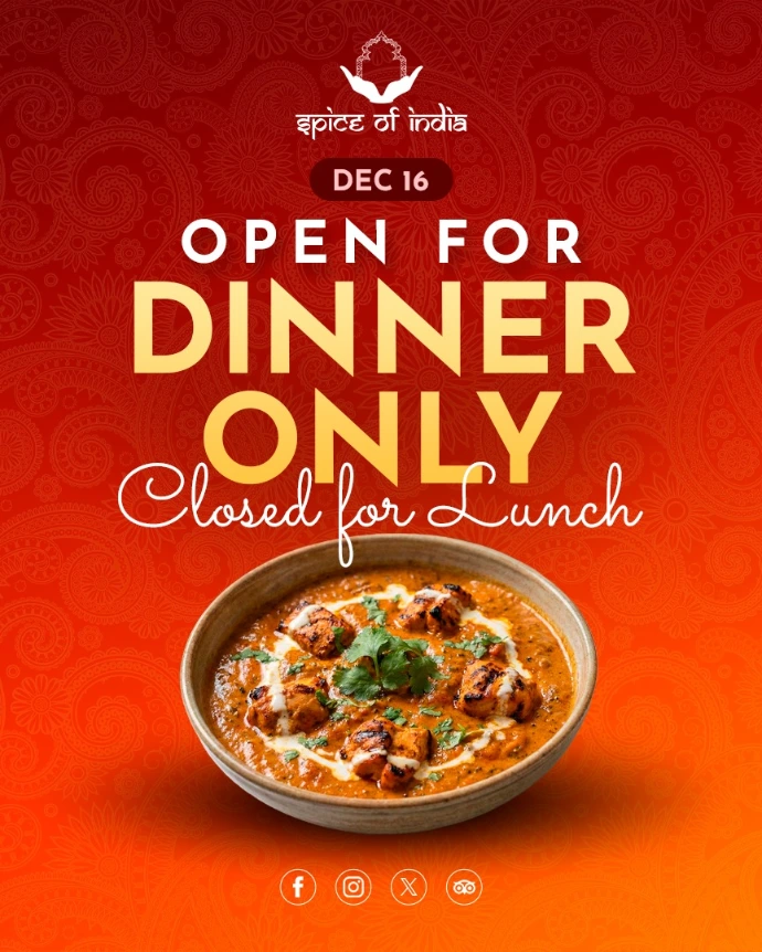
Social media — Instagram post with gradient + mandala watermark
Napkin/packaging — monochrome stamp version
Business card — logo with wordmark
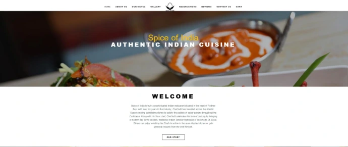
Website hero — logo on dark background
The logo never needs redesign — only re-skinning.

Outcome
A timeless, culturally grounded mark that avoids category clichés, communicates warmth and premium quality, and scales from favicon to storefront.
The mark now serves as the visual anchor for St. Lucia's top-rated Indian restaurant — a small doorway into India, held open by two hands.
NEXT PROJECT
Next Project →
[Project Name]
[Category]