
Since 90 Design
Where heritage meets the future.
I reinterpret the creative legacy rooted in the 1990s for the digital age—speaking the language of history through modern design.
Logo & Monogram Design Philosophy since90design.com
At Since 90 Design, I believe a logo is more than just a graphic; it's the visual heartbeat of your brand. It's a first impression, a silent ambassador, and a timeless symbol that embodies your story, values, and ambitions. Case Studies on Since 90 Design logo & Monogram
My Core Design Principles
My design philosophy is built on three core principles that guide every project:
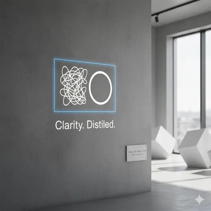
Strategic Simplicity
In a world of noise, clarity wins. We distill complex ideas into clean, memorable, and impactful marks that are instantly recognizable and easy to recall.
Discover more
Meaningful Storytelling
Every curve, colour, and font choice is intentional. We design logos that are not just aesthetically pleasing but are deeply rooted in your brand's unique narrative, creating an emotional connection with your audience.
Timeless Functionality
A great logo must stand the test of time and work across every medium—from a tiny mobile screen to a giant billboard. We craft versatile designs that remain effective and relevant for years to come.
Continue reading
What is a Logo? Your Brand's Flag.
A logo is the foundation of your brand identity. It's a unique symbol or design that identifies your business and differentiates it from competitors. A well-designed logo builds trust, fosters loyalty, and provides professional credibility.
![]()
Key Uses of a Logo:
Website & Social Media: Your profile picture and favicon across all digital platforms.
Marketing Materials: Business cards, brochures, flyers, and email signatures.
Product & Packaging: Labels, tags, and on the product itself.
Brand Merchandise: T-shirts, mugs, pens, and other promotional items.
Signage: On your office, storefront, or vehicle.
What is a Monogram? The Art of Elegant Abstraction.
A monogram is a distinctive symbol created by creatively combining two or more letters (often a company's initials or an individual's name) into a single, cohesive graphic unit. It is the epitome of sophisticated branding, offering a classic, compact, and highly versatile alternative to a full-word logo.

Why Choose a Monogram?
For a Professional & Established Feel: Perfect for consultancies, law firms, luxury brands, and creatives.
For Memorability: A cleverly designed monogram becomes an intriguing and unforgettable mark.
For Versatility: It works exceptionally well in confined spaces like social media avatars, app icons, small products, and seals.
For a Timeless Aesthetic: Monograms carry a heritage of craftsmanship and elegance that rarely goes out of style.
Key Uses of a Monogram:
Brand Mark: As the primary logo for your business.
Supplementary Logo: A shorter alternative to your main logo for specific uses.
Favicon: The perfect, recognizable icon for your website's browser tab.
Seal of Authenticity: On certificates, high-end packaging, or stationery.
Case in Point: My Own Rebrand
The Challenge:
To create an identity for a "designer" that stands out in a saturated market. The identity needed to communicate a long history without feeling dated and convey creativity alongside utmost professionalism.
The Solution: I developed a mark that is:
Memorable: The abstract monogram is unique and ownable.
Meaningful: Every element, from the negative space to the typography, has a rationale.
Adaptable: It functions in single color (for embossing), full color, and at various sizes.
Enduring: By avoiding clichés and focusing on elegant form, I created a logo that will age gracefully, just like the quality of my work.
The Complete Identity System
The true power emerges when both elements combine. The monogram captures attention and builds memory, while the wordmark ensures clear understanding. Together, they form a versatile system that works perfectly everywhere—from a tiny favicon to large-scale stationery.
The Wordmark & Typography:
Complementing the abstract symbol is my wordmark, set in a clean, geometric sans-serif typeface. This choice was intentional to communicate:
![]()
Clarity: Easy to read and understand, just like my design solutions.
Timelessness: Sans-serif fonts avoid fleeting trends, ensuring relevance for years.
Professionalism: It conveys trust, reliability, and expertise.
![]()
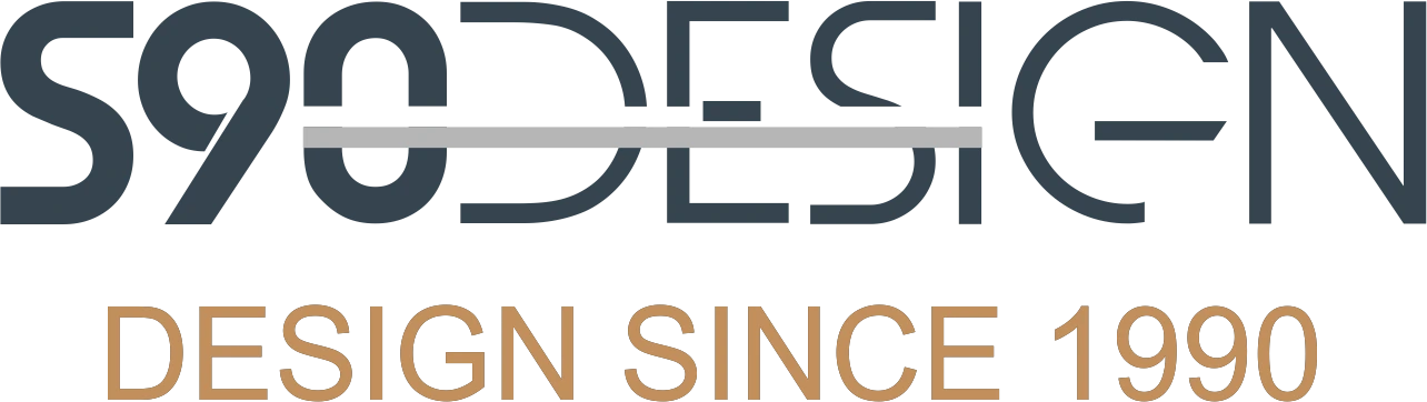
The Tagline: "DESIGN SINCE 1990"
This is my badge of honor and my promise—a constant reminder of my experience and the evolution I've witnessed. It tells clients they are working with a seasoned designer who has depth and historical perspective.
This identity is a testament to my belief that the best design is where substance meets style. This is the same thoughtful process I apply to every branding project I undertake.
My Design Process: Developing Your Signature Mark
Discover: We start with a conversation to understand your vision, target audience, and industry landscape.
Design: We translate your story into initial concepts, focusing on strategy, symbolism, and style.
Refine: I work with you to polish the chosen concept into its perfect final form.
Deliver: You receive a complete logo suite with all the necessary file formats for print and web, ensuring you are ready to build your brand everywhere.
Let's build a symbol that doesn't just identify your business—but defines it.

Let's Build Your Identity
Does the story behind my work inspire you? Let's create a unique and meaningful identity that tells your story and connects with your audience